This post was inspired by SEO expert Dr. Marie Haynes’ summary of the Google SEO Starter Guide, posted January 25, 2024 in The Search Bar (highly recommended).
At the 2:50 minute mark of the review, Dr. Haynes points out a part in the transcript where Lizzi from Google states:
“…so it has a very high satisfaction rating for the thumbs up…”
Dr. Haynes then poses the question – is this used in machine learning systems? She explains:
“This would show systems examples of helpful content and not so helpful content; which would then learn all the factors it could consider, to come up with something that’s really good at predicting whether content is helpful or not….”
Recent updates to Google’s ranking factors have put a spotlight on creating content that your users find valuable. First, we saw the rollout of Google’s helpful content system in August 2022. This was followed by major algorithm updates in December 2022 and September 2023.
NOTE: This analysis was done using the previous version of the SEO starter guide but the principles still apply.
Here are 6 content observations that I see to be very useful to both search engines and online users:
Document Navigation
Observation
Sticky documentation navigation on left side and table of contents on right side.
Analysis
We see the use of table of contents (TOC) more often online especially those pieces that require specific length but how helpful is it if it isn’t sticky? For long-form guides tackling complex topics, simply adding a static TOC requires scrolling back to the top repeatedly, interrupting your focus (how tedious). A fixed side navigation bar enables effortless access to specific sections as needed.
<INSERT PICTURE>
Even on short form posts, the ability to seamlessly reference certain content sections aids comprehension. Pinpoint jumping eliminates disrupted linearity or straining memory (benefits for the users). And targeting the most useful information in real-time optimizes behavior metrics such as time on page (benefits for the search engine).
An SEO optimization would be to add a TOC within the contents with anchor links to the section heading but is that honestly doing anything for users
If you are using any sort of pillar content strategy, resource guides, or any content that requires subtopics it makes sense to provide another menu on the left hand side as Google does to allow you to browse other search essentials topics.
For Google’s users, this is helpful and satisfying. Would it be helpful for your users?
Efficient Use of Material Symbols Iconography
Observations
- A star icon next to the “Glossary” section and is formatted in blue.
- Another star icon next to “Do You Need An Expert” section and is formatted in blue.
- A school icon next to the site search explanation section and is formatted in green.
- A check icon indicates recommended actions and a “not interested” icon in red indicates actions to avoid
Analysis
When I inspected the image used in the Glossary section it was the star icon coming from the Google Material Symbols library.
In the Google Developers Guide states:
“Material Symbols are our newest icons, consolidating over 2,500 glyphs in a single font file with a wide range of design variants”
These icons are found in Google Fonts. I like the description at bottom of their web page:
“Google Fonts makes it easy to bring personality and performance to your websites and products. Our robust catalog of open-source fonts and icons makes it easy to integrate expressive type and icons seamlessly — no matter where you are in the world.”
I can see how the use of iconography can benefit users as well as keep them engage especially those with disabilities. The question is will your users be satisfied? What about machine learning algorithms, how do they process this information? I would research the keywords: Supervised Learning, Unsupervised Learning, and Convolutional Neural Networks (CNN).
The star icon used in the Glossary and Do You Need An Expert may signify importance with the use of the star. Something to think about; what is the psychology of the color blue in learning situations? How does a machine learning algorithm process the color rgb19, 25, 62?
The color block with color code rgb19, 25, 62 = dark blue and star icon is used consistently in the three sections defined below. Each section used the star icon from Google’s Material Symbols library. The content of all sections are a learning opportunity for the user. The formatting is consistent with the H2 headings and the one P at the bottom.
| Heading Text | Text Formatting | Icon | Section Color |
| Glossary | H3 | Star | Dark Blue |
| Do you need an expert | H3 | Star | Dark Blue |
| Understand the difference… | H3 | Star | Dark Blue |
With my little research I learned that a machine learning algorithm may first take initial observations such as how the color is represented and its distribution on the page. Next, it might look for any context specific interpretations such as when used in Glossary. Is this dark blue associated with definitions or explanations? Or maybe linking to expertise in the section “do you need an expert” associating the color with seeking professional help or guidance. It then may reinforce this interpretation further by associating the star icon which is often associated with highlighting important information may act as a visual cue. In this case the star might symbolize a potential benefit of seeking expertise.
Google uses a school icon, looks like a graduation cap, next to the site search explanation which may visual signal a key learning opportunity. This makes sense, as schools are associated with gaining knowledge; a key section to pay attention too.

Green “check” icon is a material icon in either case it is a great visual for the user to be aware that the actions below are indeed recommended.
“Not interested” or “avoid” icon may be a material icon in either case it is a visual for the user to avoid the actions suggested.
In the guide updated 02-02-2024 the only mark up with colors and icons is in the “how does google search work section“; it appears to be a lightbulb but may be referred to as something else in the official material symbols library.

Direct User Feedback Analysis
Observations
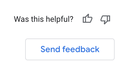
Was this helpful? Thumbs up or thumbs down action button and Send Feedback button.

Analysis
Clicking thumbs up/down allows for a quick reaction and allows the user to submit reasoning for their feedback.
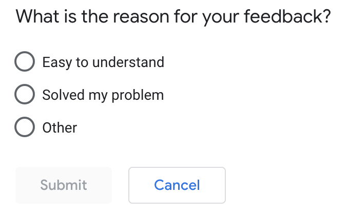
By clicking thumbs up, Google wants to know if their content was easy to understand, if it solved “my” problem, or other; with no option to comment further by selecting this option.

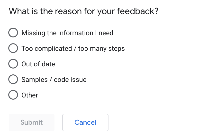
By clicking thumbs down, Google wants to know if the article was missing information, too complicated or too many steps, out of date, samples or code issues, or other; again no option to add comments.

For more insights into how these feedback mechanisms enable machine learning to better understand helpful content or user satisfaction patterns over time, refer back to SEO expert Dr. Marie Haynes’ insightful first impressions referenced earlier.
Simplified Social Sharing
Observations
Instead of adding a social icon grid for users to share the whole article; all headings simply have “link icons” on hover with the alt text to “copy link to this section”.
Analysis
If we inspect the code on the Google Material Icon for “link” we see a data attribute is used on the id:
data-id="who-is-this-guide-for"First, allowing readers to instantly copy and share links to specific sections provides immense user convenience. Rather than needing to manually highlight the words, right click, and click “copy link to highlight” for example which gives a long URL which isn’t clean. This is convenience.
With shareability more frictionless, users can easily share relevant advice to their audience and direct contacts via social channels, email, chat, and more. Additionally, the linked section IDs provide clearer context when readers share recommendations with others. This is shareability.
Anyone clicking the shared link goes straight to the exact passage being referenced rather than having to locate it within full documents. This is context preservation.
Technically, the data attribute allows event tracking to be placed via Google Tag Manager. Using this attribute keeps analytics top of mind for developers when designing websites; what could it infer to a machine learning algorithm? Users clicking this link to copy and share may signal an improved user experience which could indicate a higher level of engagement.
Helpful Code Boxes
Observation
Code sample boxes have view in light/dark mode option and allow scrolling and copying code
Analysis
As a refresher, Google displays code samples in defined sections with gray backgrounds, while letting readers easily copy, scroll, or toggle light/dark mode.
For any site dealing with development languages, these formatting perks make a world of difference for audience retention (analytics behavior metrics).
Don’t believe it? Note Google specifically asks if “sample or code issues” contributed to negative page ratings. Clearly they acknowledge helpful code presentation’s importance to users.
This has been removed on the 02-02-24 update.
Contextual Image Alt Tags
Observation
Google’s image alt text not only describes the visuals but the context of the visuals.
Analysis
Describing an image’s contextual significance rather than solely its visuals demonstrates care for users with visual impairments relying on assistive devices. Supplementing visual information widens comprehension.
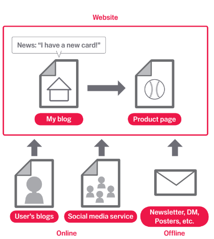
In an exercise highlighting this point, Google’s alt tag for the image under the Optimize your content – make your site interesting and useful section is:
img alt="Creating interesting new content can generate links from other websites." 
The images illustrate the concept rather than stating it.
After review, these 6 content features intersect with accessibility in multiple ways. Allowing customizable experiences sets the perfect example of Google’s user-first mentality.
Desmond’s Final Thoughts
First a word from Dr. Marie Haynes:
“As SEO’s we want so much to learn by example. It can be tempting to say, “Ah, well now I need to change my content to look more like Google’s.”
I think we can get inspiration from what’s ranking, but our goal needs to be providing what’s helpful for searchers first!”
So, after review we can see how Google has clearly made several smart UX decisions that improve the guide’s ability to educate users. These smart decisions may also feed into machine learning algorithms to provide examples of helpful content.
In summary, The variety of icons, color coding, and special formatting seems intended to make the guide highly visually engaging and easy to scan. Interactive elements like the feedback button and copy link create an optimized learning experience for users and the search engine. Elements including the sticky navigation, descriptive alt text, and key term callouts enhance wayfinding and comprehension. The use of avoidance icons and language provides clear best practice guidance for users and gives patterns to machine learning algorithms.
